Context
Visiting museums is a thing that many people do less that they would like to. The time consuming research of information and the lack of a detailed overview of the ongoing exhibitions, bring laziness to the users to plan a proper visit.
Furthermore, there are museums struggling to get more visitors. Some of them are not very popular and do not offer a website, but still have interesting exhibitions.
The goal of this UX/UI project aims to support museums in Berlin in fulfilling their mission to preserve and activate cultural heritage, while making it more accessible and engaging for all individuals. This project was developed during my UX/UI Bootcamp at Ironhack, therefore there is not a "real" client.
Research
To identify the needs of potential users, we did extensive work involving secondary and primary research. On one hand, the statistics showed us that there are some main points why the museums had lost visitors in the last years. On the other hand, through interviews, we discovered that the insights from these interviews validated the findings from our secondary research, also that many of the users agreed on the same aspects.
"I always use digital platforms for purchasing tickets and checking information"
(Azyade, 34)
"All museum information in one place would be helpful, simplifying the planning process "
(Mahyar, 32)
"I use google and internet to find the information, but usually I have to jump from site to site"
(Sam, 44)
"I always check the price and location of any exhibitions before deciding or planning any visit"
(Juliana, 30)
To organise these findings in a meaningful way, we gather all information of the research and narrow it down using an affinity diagram. This lead us to define the main points users struggle: how to get informed, pricing, location, motivation and ticket purchasing.
Awareness
Price
Location
Motivation
Ticketing
This insights facilitated the creation of a persona to better understand our target user, their behaviours, motivations, and needs of the intended audience.
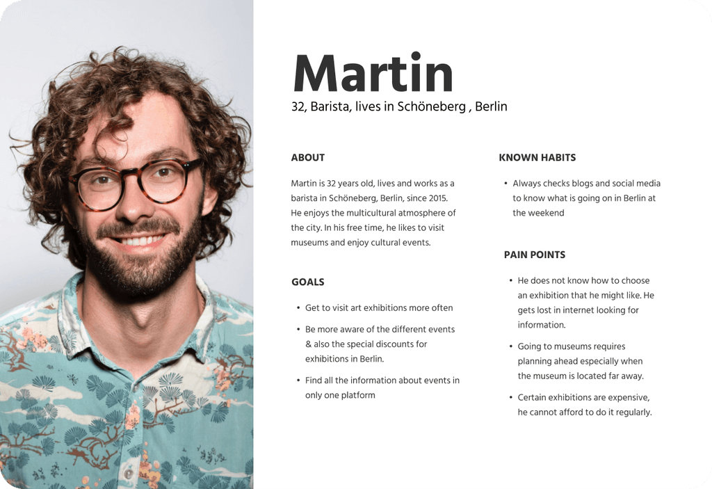
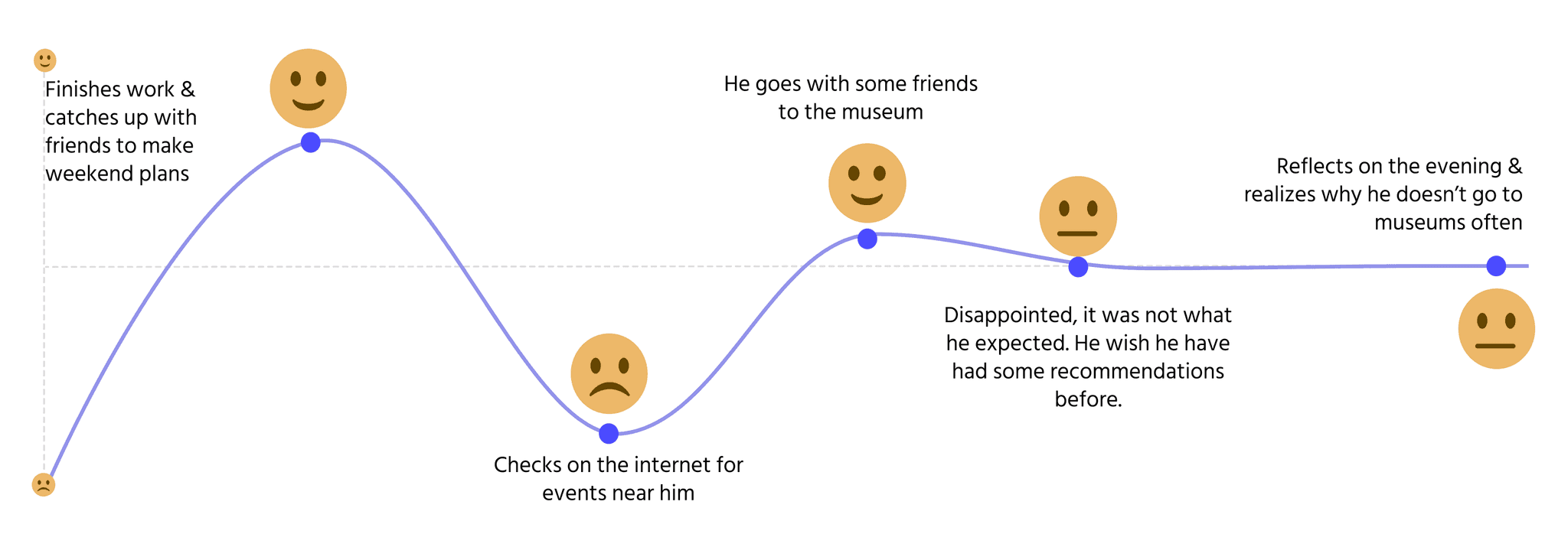
In order to comprehend the complete experience Martin undergoes while exploring a museum, we develop his user journey, which offers a clearer understanding of his pain points throughout various stages. This also presented us the opportunity to identify design possibilities, prioritizing areas that require attention and innovation. By utilizing the user journey map, we were able to establish a problem statement and develop UX/UI strategies that tackle his pain points, guaranteeing a smooth and captivating museum experience.
Ideation
We practiced in team several ideation techniques to ideate a solution and start thinking on the final product. We brainstormed and discussed about the challenges the apps need to solve, the features we need to design in order to let the user reach their goal, in this case to discover an access a successful museum visit. To have an overview of our needs and their priorities we organised those ideas on a Moscow diagram. This lead us to highlight some design decisions that should be completed to have MVP.
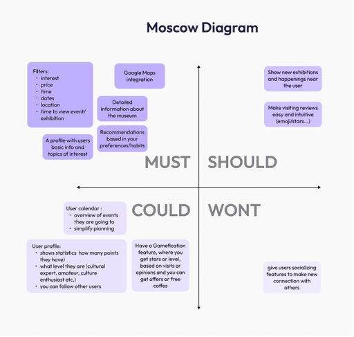
Design decisions for the app:
Home site with recommendations: Fresh, Near you, Recommendations for you…
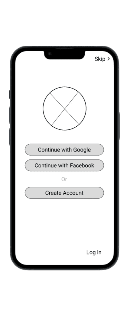
Can select interested topics to get personalised recommendation
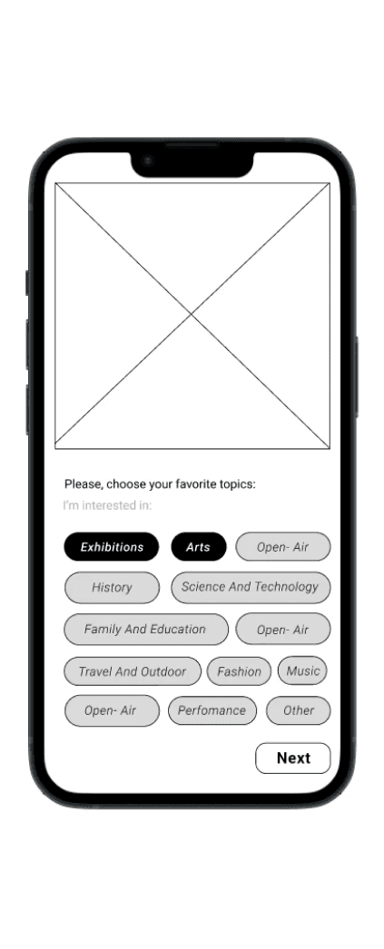
Show a list of all museum, based on location (show main info, price, opening hours, type, address) with Specific filters. Show it also on map
Have an option to buy single tickets
Have a membership option
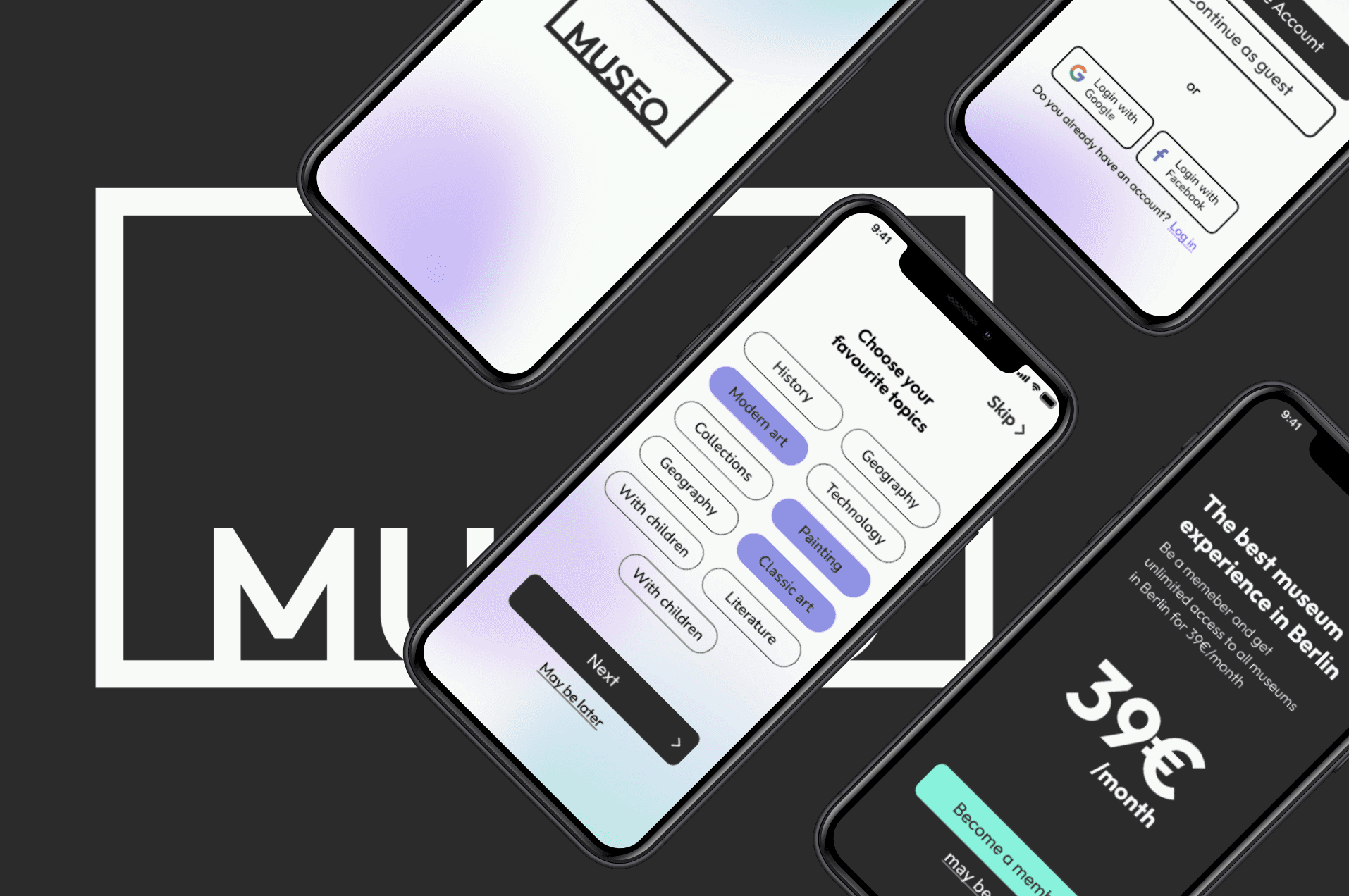
Creating the User Flow

Ideation
After defining the prioritise the features that the app needed, we started sketching the wireframes and ideating the screens. After some rounds of sketching we were able to test the mid-fi prototype.
STEPS:
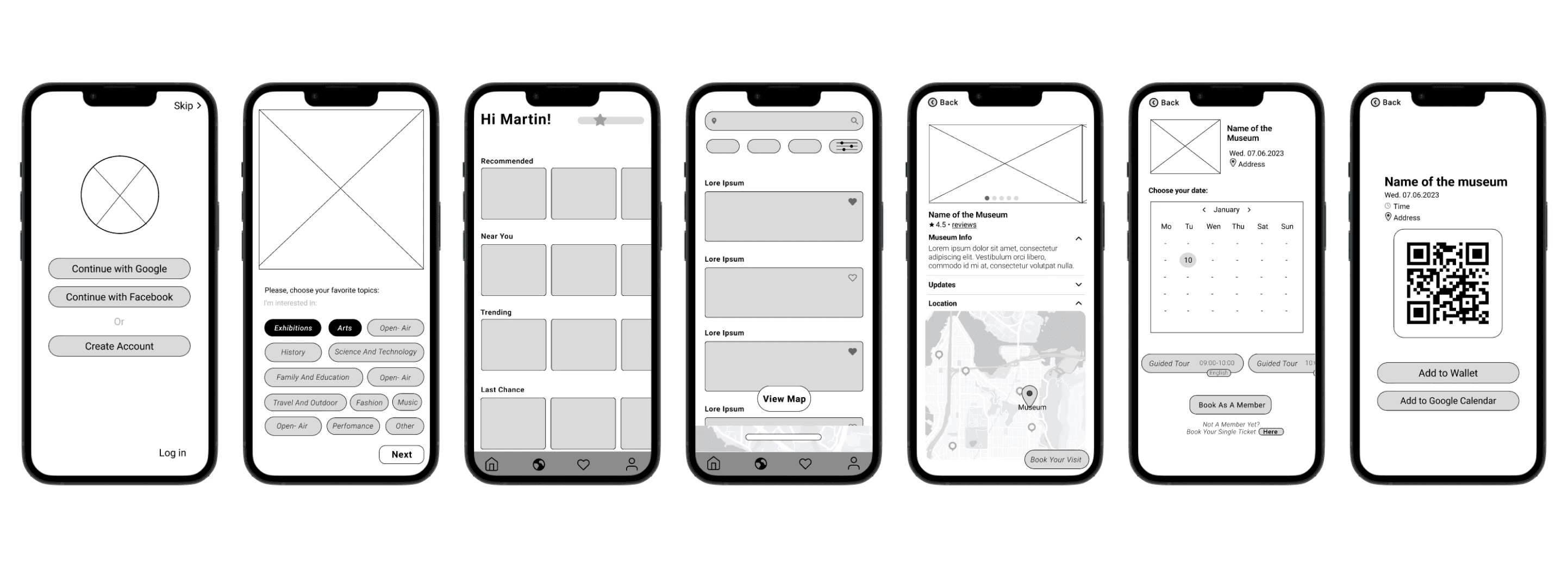
Register and become a member
Choose topics of your interest
Home: personal recommendations for your (based in your interest and location)
Explore: search and filters for museums
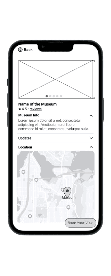
Museum site
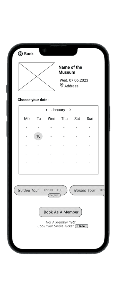
Get ticket
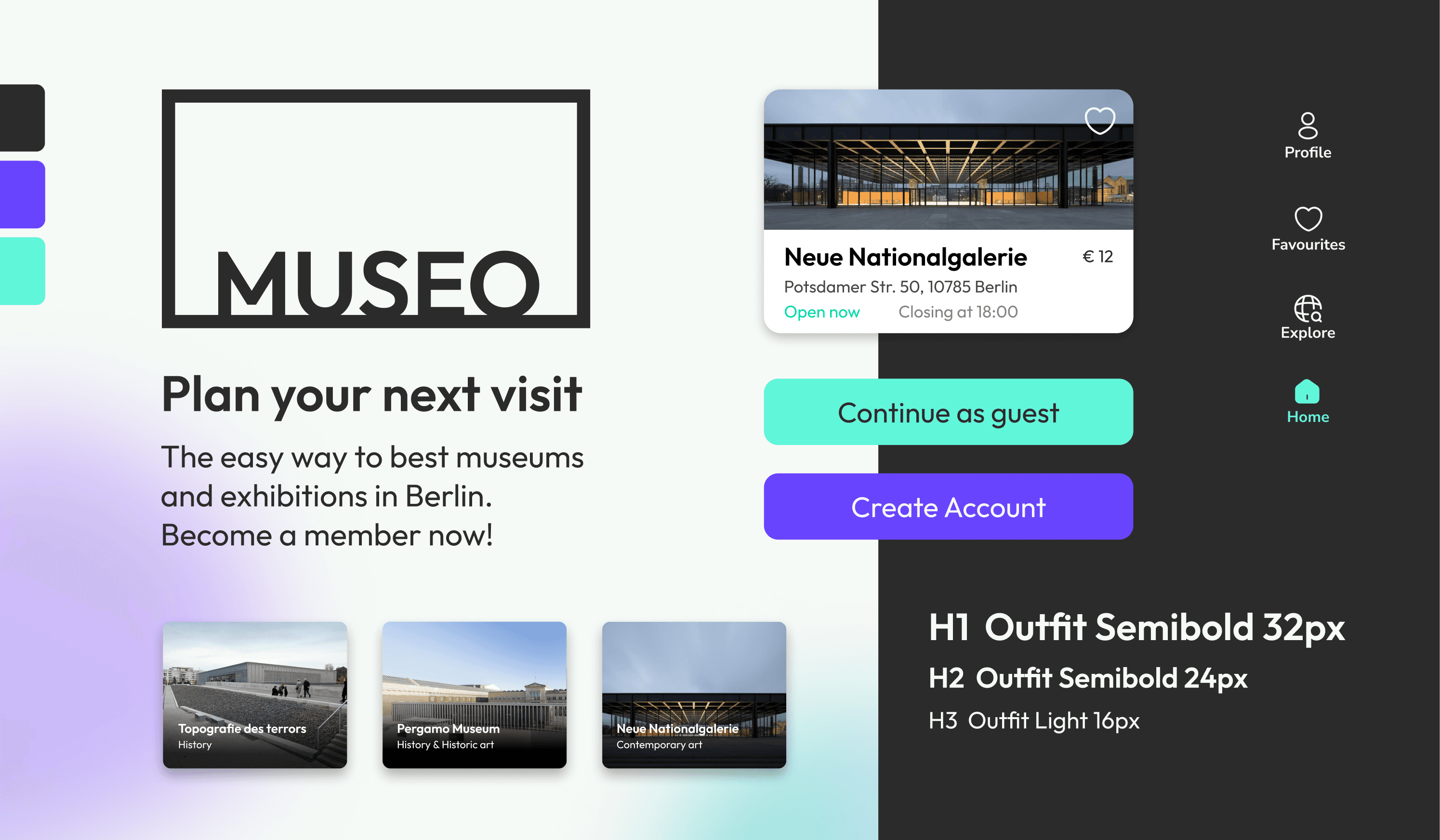
UI Design tile
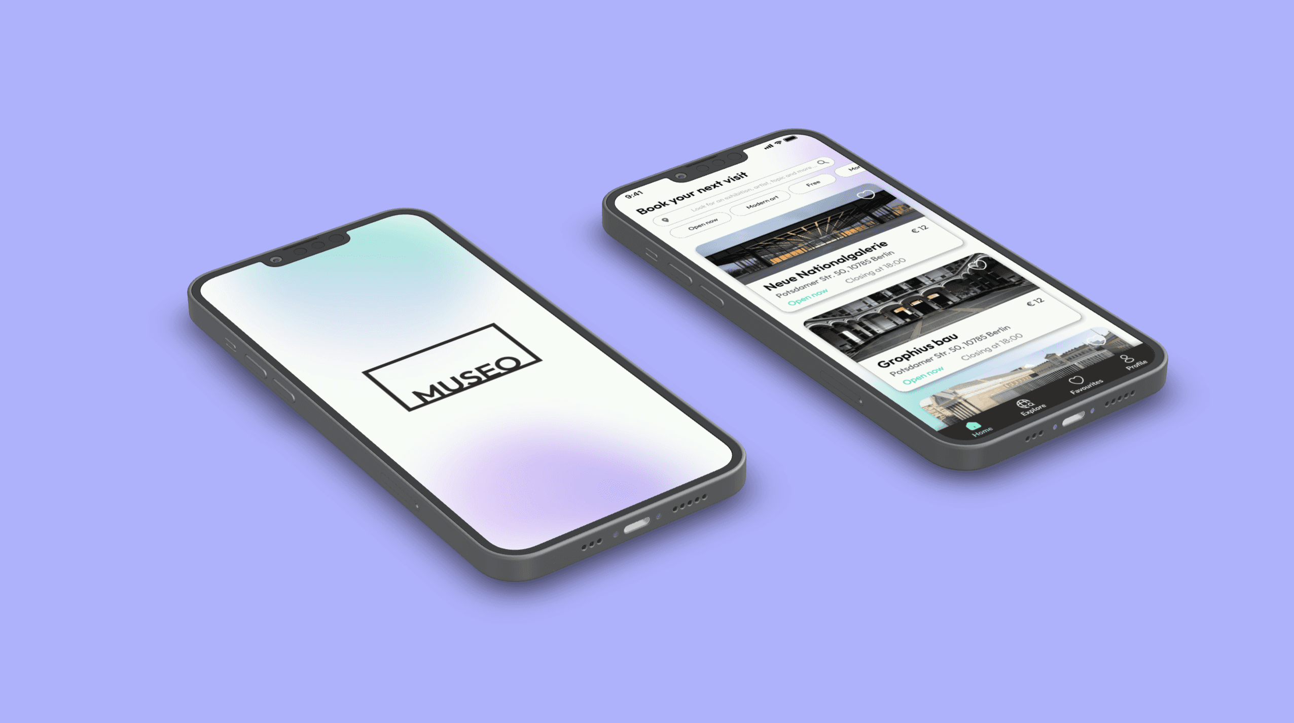
In order to give more personality and definition to this project, I designed the first hi-fi wireframes, creating the design tile, with a logo and a visual identity for the app.
Next steps
The next steps would be to define all the screens and posibilities of the app, creating them as mid-fi prototypes to test the concept and the usability.
After that we would be able to design the hi-fi product on its whole version, create a accessible design system, test and iterate.
Conclusions
Defining user needs can be challenging and it is difficult to create a product that works for everything or everyone. We had to set priorities and focus on the MVP to define the most significant features and user flow of this app.